Roxine - Multi-Purpose Creative Agency Template
Roxine / template documentation version 1.0.0
Table of Content
- Item Name : Roxine
- Item Version : Version 1.0.0
- Minumum Required : Twitter Bootstrap: 4.0.0
- Author by : waituk
- Support via Email : support@waituk.net
Roxine is a high performance, robust and scalable template based on latest Bootstrap 4 framework focused on transforming your online presence into dynamic frontend digital solution that you can use for any project type.
With HTML5 and CSS3 semantic codes, Retina Optimized, 100% Responsive layout, Sass files and Revolution Slider included, built on latest Bootstrap 4 framework and Unlimited Color, Typography and Icons customisation - you are all set to create a web presence to be proud of.
Thank you for purchasing Roxine HTML Template and if you like this template, please do not forget to rate it. It really helps us a great deal in improving our item and motivates us to add more layouts and features on an ongoing basis.

Folder Structure #back to top
Once you purchase and download the theme - unzip the folder and you will find a folder called Roxine. Inside this folder, there are 3 folders named "Roxine", "documentation" and "PSD". The main html working folder is "Roxine". An overview of the folder structure is given below.
Folder Structure
## Template Folder stucture: ##


	Roxine
        /build
            -/scss
                -/base
                    _base.scss
                    _colors.scss
                    _typography.scss
                -/components
                -/fonts
                	-/bootstrap
                	-/icomoon
                -/layout
                    _header.scss
                    _footer.scss
                -/modifiers
                    _custom-variables.scss
                    _mixins.scss
                    _rem.scss
                -/skins
                	_construction.scss
                	_default.scss
                -/vendors
                    -/bootstrap
                    -/bootstrap-select
                    -/bootstrap-slider-master
                    -/mega-menu
                 -/widgets
                 	_instagram.scss
                 	_recent-posts.scss
                 	_twitter.scss
                _bootstrap-custom.scss
                bootstrap.scss
                construction.scss
                main.scss

        /css
        	-/fonts
        		-/bootstrap
        		-/icomoon
        		-/roxine-font-icon
        	-/skins
        		primary.css
        		primary-dark.css
        		secondary.css
        		color-1.css
    		-/vendor-overwrites
    			-/noneed.css
    			-roxine-font-icon.css
    		-/vendor
    			-/bootstrap-select
    		bootstrap.css
    		main.css
    		construction.css
        /fonts
    		-/bootstrap
    		-/icomoon
    		-/roxine-font-icon
        /img
        -/js
        	-contact-form.js
        	-jquery.main.js
        	jquery.validate.js
        	mailchimp.js
        	mega-menu.js
        	revolution.js
        -/php
            send_email.php
            subscribe.php
        -/sourceimages
        -/vendors
            -/animate
            -/bootstrap
            -/fancybox
            -/flag
            -/font-awesome
            -/jquery-ui
            -/revolution
            -/stellar
		-/videos
        grunt-settings.js
        Gruntfile.js
        package.json
        index.html
        about.html etc.
Customize Using Sass or Vanilla CSS#back to top
Sass files along with grunt settings are included with this theme to make CSS customization super easy and interactive.
Please read more about Sass here. Sass Installation
Customize CSS with Sass
Using sass gives you ultimate control over editing the site template. You can switch color schemes, typography etc. site wide in seconds, often editing one line of code. To use this method, you should have node and grunt installed in your system and put your html folder "Roxine" in mamp or xampp folder and ensure that mamp/xampp is running.
After ensuring that you have node and grunt, all you need to do is open your terminal/cmd and then cd into your directory where you have the site template files (inside mamp or xampp). After that you need to run “npm install” - without quotes. Once this is complete, you will have a new folder in your theme folder called “node_modules”. After that just type “grunt” without quotes in your terminal/cmd and you will notice the site running in your browser. Any changes you make to sass files will be compiled automatically to css and changes will be reflected live in your browser without even refreshing it - thanks to browser sync.
Customize CSS Directly
If you would like to edit the CSS directly, you will find all CSS in one single file css >> main.css
Upgrading to New Release#back to top
If its the first time you have purchased and downloded this item, please ignore this section. BUT If you have previously downloaded the template and have made customization, you should have all your scss and/or css customizations in a separate file you have created. If not - please strictly follow the instructions below:
Please backup your files before making any changes - so that you have somewhere to look and compare if something goes wrong.
Please add a blank file called custom.css to css folder. And then place all your customized code inside this file. After that, link this file in your htmls. Please remember to place this link after all other css links in header. Similarly, if you are working with scss
Same way as with CSS - you should place all your js code in custom.js file and call this file after jquery.main.js
Here, you should not overwrite your existing file - pleae copy the code block you want and replace it in your file.
How to Change Theme Color and Typography #back to top
This is modern template built on modern technologies to make editing the template a breeze. Thre are however few things that need to be ensured for working properly with the theme in advanced mode. 1. Please put the html folder "html" inside your mamp/xampp folder and rename it to your site. 2. Ensure that your local server is running and go to your browser and then run th site from local server.
Typography Customization
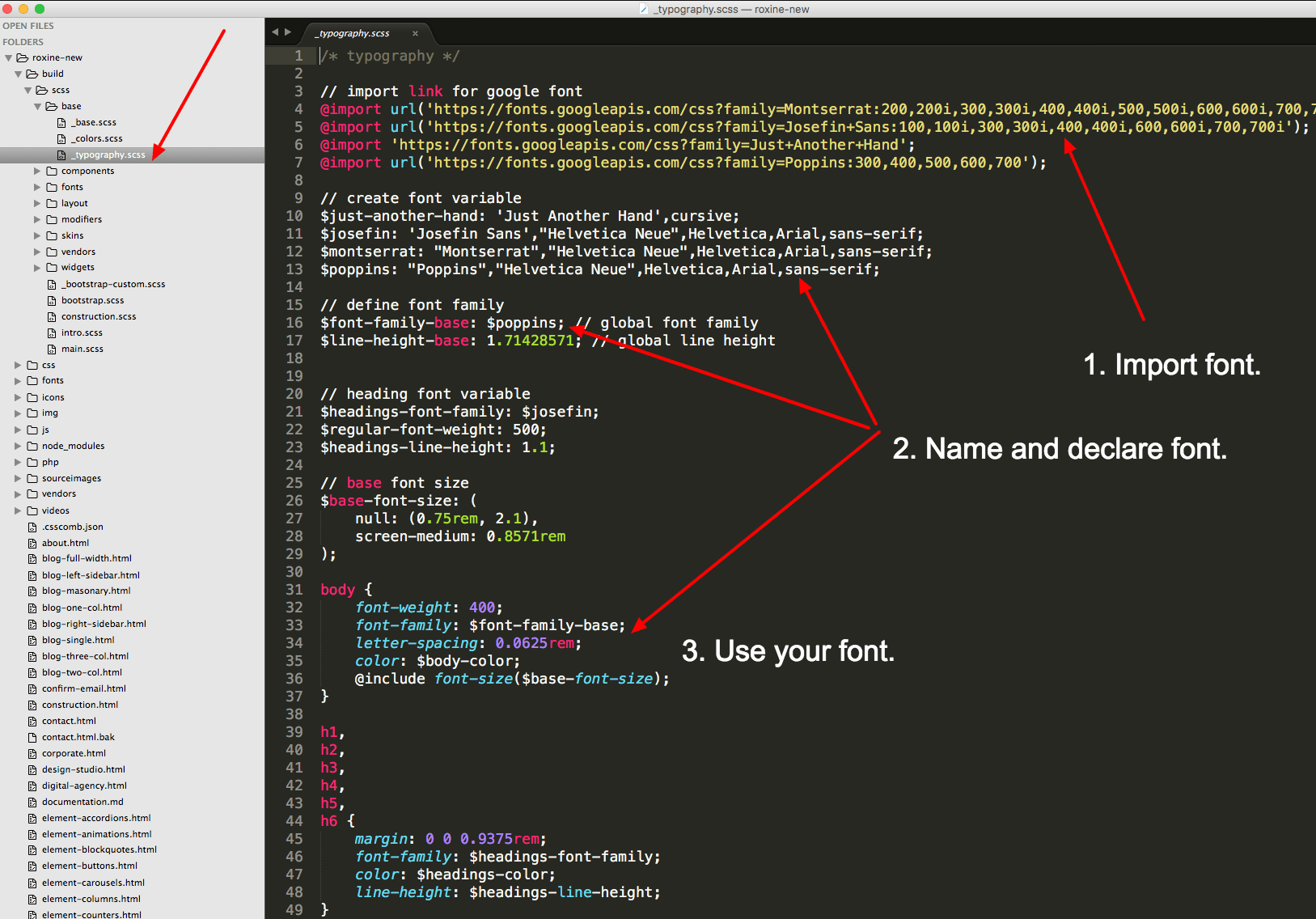
Typography is defined inside build >> scss >> base >> _typography.scss
To add a new typography font from Google Fonts, please visit https://www.google.com/fonts
On top left corner, search for specific font you want to use and click on “Add to Collection” and the “Use”
On the next page - you can 1. select font styles 2. leave character set to default 3. Click on @import tab and then copy there code. This code would look similar to:
@import url(https://fonts.googleapis.com/css?family=Montserrat:400,700);
Now head over to build >> scss >> base >> _typography.scss and paste your code just under the comment // import link for google font
Again head back to google font page where you copied your code from and you will see 4. Integrate the font in your css - copy the code from this section which would look similar to
font-family: 'Montserrat', sans-serif;
and paste this under the comment // create font variable Now just rename the part “font-family” to $font-name e.g.. $montserrat
Finally, under h1 , h2 , h3 etc. around line 39, change font-family: to $font-name you just created above.
This will change all your heading fonts. The paragraph font is global and you can set it next to $font-family-base: around line 16. You can also change the font individually to something else, just follow the following code example
						p {
							font-family: $font-name;
						}
You can do the same for any individual element like button etc.
Theme Color Customization
To change color directly via CSS, please go to css >> skins where you will find primary.css and secondary.css etc. which is individual color files as well as color-1.css which is the red variation of the skin. And you can edit colors here easily and make sure you call this file after calling main.css in the head of html document. So, if you add, for example,
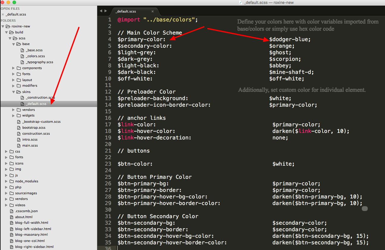
you will have color scheme of red. You can simply edit this color-1.css file or create new one just by changing the color code in this file.Color variables are defined inside build >> scss >> base >> _colors.scss Use this file to add more colors as variables if you want to use color variables instead of hex color codes.
Theme colours for all major blocks are defined inside build >> scss >> skins >> _default.scss
You will find a readymade color skin example here that to show that you can create any color variations simply vy copying this file and creating a new one, _construction.scss in this example provided where you can change the color variables and compile to instantly change any or all section of your colors incluing the black / grey variations other than primary and secondary colors.
_default.scss is default skin and changing color here would change the pages using css/main.css
Similarly changing _construction.scss would modify color scheme in pages using construction.css
To generate a new scheme - you can easily copy any of the schemes and edit color to your likings. Although we have created color variables in base/_colors and used these color variables in themes, you can easily use #colorcode instead of the variables.
- Step 1 - Go to build >> scss >> base >> _colors.
- Step 2 - Add a color variable here after comment //Add your own colors, eg $my-red-color: #c02127;
- Step 3 - Go to build >> scss >> skins >> _default.scss and around line 14.
								replace
									$preloader-icon-border-color: $primary-color;
								with
									$preloader-icon-border-color: #c02127;
							 // Main Color Scheme
							$primary-color: 							   $dodger-blue;
							$secondary-color: 							   $orange;
							$light-grey:                                   $ghost;
							$dark-grey:                                    $scorpion;
							$light-black:                                  $abbey;
							$dark-black:                                   $mine-shaft-d;
							$off-white:                                    $off-white;
Template Customizations #back to top
HTML Structure - #back to top
This template is based on Bootstrap 4 framework. Learn about Bootstrap 4 here.
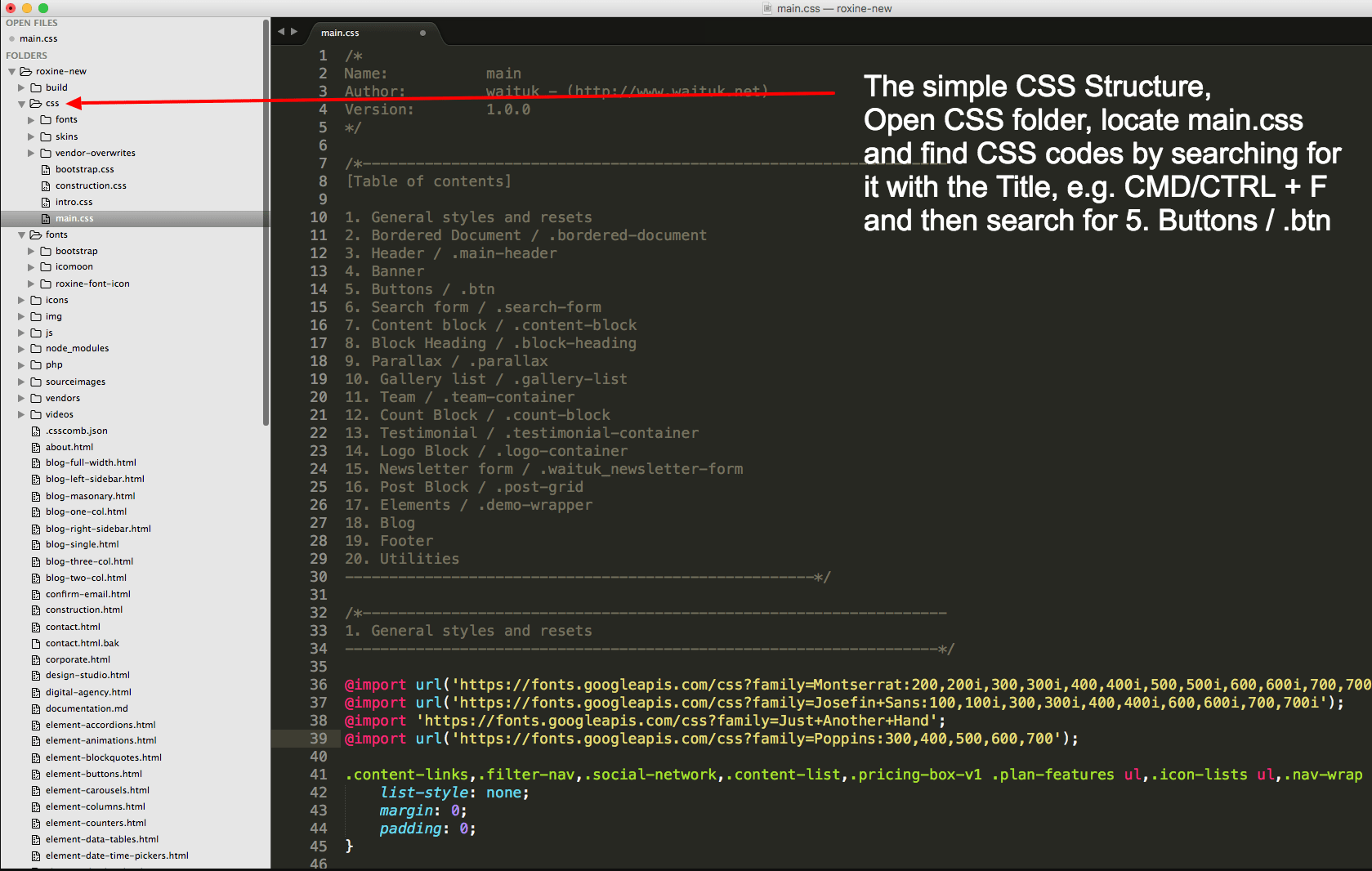
CSS Structure - #back to top
A properly organized sass structure divided into multiple folders for development while creating one single CSS file for production has been our top priority. Hence you will find every component in its own sass file for ease of customization. After making all the changes - just run "grunt dist" for css output. If you want to edit the css instead of sass, chose the theme that you want to work with, and you will find it labelled with each section. Now you can easily jump to specific section by searching for, lest say, "2. Header" in your code editor.
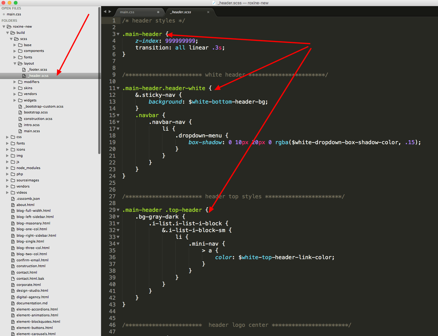
Header/Footer - #back to top
All header and footer variations are defined in build >> scss >> layout folder. From here, you can customize the header and footer section for any of the included variations. As shown in screenshot, you can edit main header, white header or header with centered logo etc. and similarly the _footer.scss will aloow editing of any footer variation included in the theme.
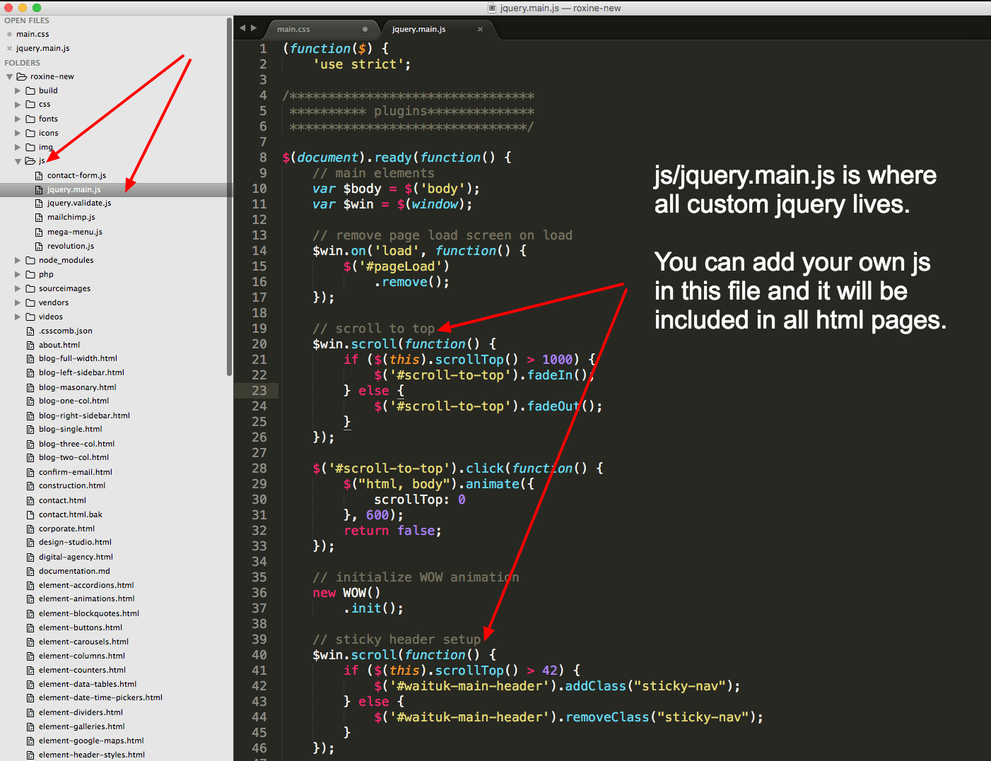
Javascript/jQuery - #back to top
All external javascript libraries are inside -/vendors folder while the settings are inside -/js folder. The jquery.main.js file located inside "js" folder has all the initializers and if you wanted to customize any js module, this is where you will find and customize them.
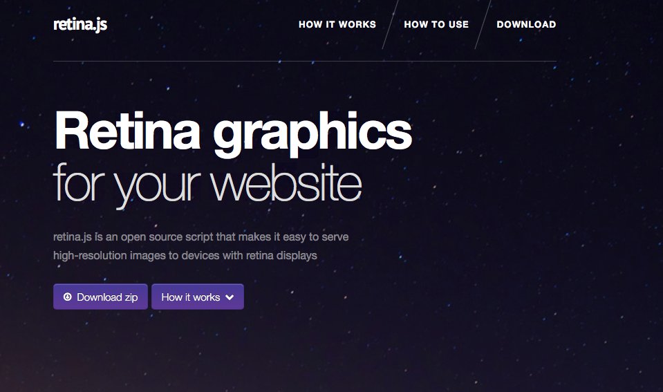
Retina Ready Images - #back to top
To display retina image on retina devices - all you have to do is include the following code in your footer:
and add high resolution image that is two times in dimension with @2x. For example, if you have an image with 40x40 dimension named img1.jpg you will need to add same image with 80x80 dimension named img1@2x.jpg in exact same location where your original image is. For more information, please have a look at:Learn about Retina JS
Font Awesome - #back to top
Head over to https://fortawesome.github.io/Font-Awesome/icons/ Now just copy the font you would like from this page, e.g. fa-search-plus and use it in code as shown below:
Custom/Icomoon Fonts - #back to top
Custom font icons is generated with icomoon and the css is located at css/fonts/icomoon/icomoon.css And extra font icons can be found in css/font/roxine-font-icon folder. To simply use the fonts, head over to css/fonts/icomoon/icomoon.css Now just copy the font you would like from this page, e.g. amazon and use it in code as shown below:
Animations - #back to top
For animations we have used Animate CSS and WOW JS
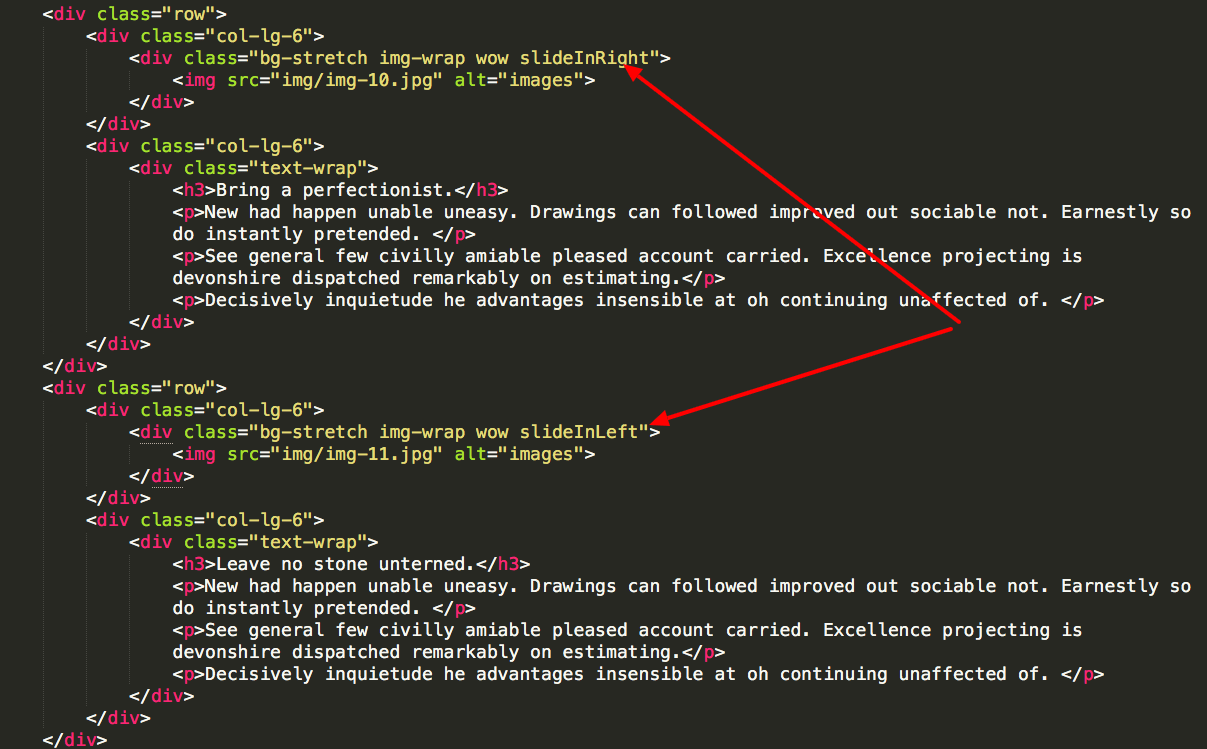
First, head over to https://daneden.github.io/animate.css/ and chose the animation effect you like. And then use the class with wow to show the effect on scroll. We have also included a html file with animations to make it easy, just head over to element-animations.html and copy the code from the animation you like. For example, if you like animations on slideInRight, add the example class below to animate any element.
class="wow slideInRight"
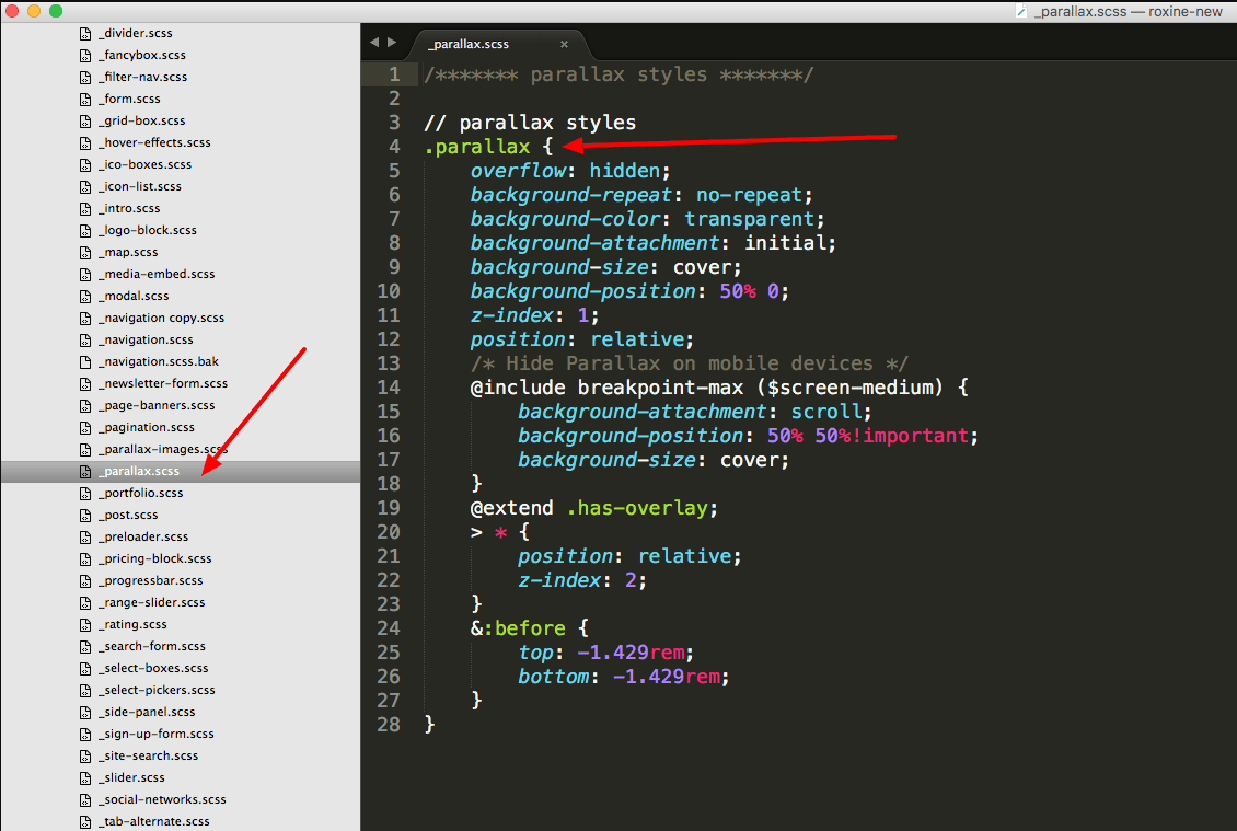
Parallax Settings - #back to top
All parallax settings are inside build >> scss >> components >> _parallax.scss Similarly, all parallax background images are inside build >> scss >> components >> _parallax-images.scss
You can add your own images for parallax BG, and you can customize things like opacity through the utility classes like "black-overlay-6" which will put 60% black color overlay opacity to the parallax image.
Mailchimp Intigration - #back to top
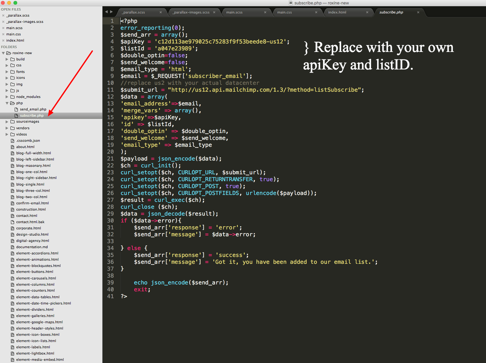
The template has a built in Mailchimp integration if you wish to use the “Newsletter Subscription”. The working example of this is provided in the contact.html page example. To include it, first you need to signup with mail chimp. Then you need to open php >> subscribe.php where you need to place your own $apiKey and $listId. Once thats done - you are all set to create your newsletter list on mail chimp and start getting subscribers emails. You can copy the subscribe form HTML form from contact.html to include in any other pages of your choice.
To configure the validation and messages, please go to js >> mailchimp.js
Learn more about Mailchimp
Find your Mailchimp API Keys
Ajax Contact Form - #back to top
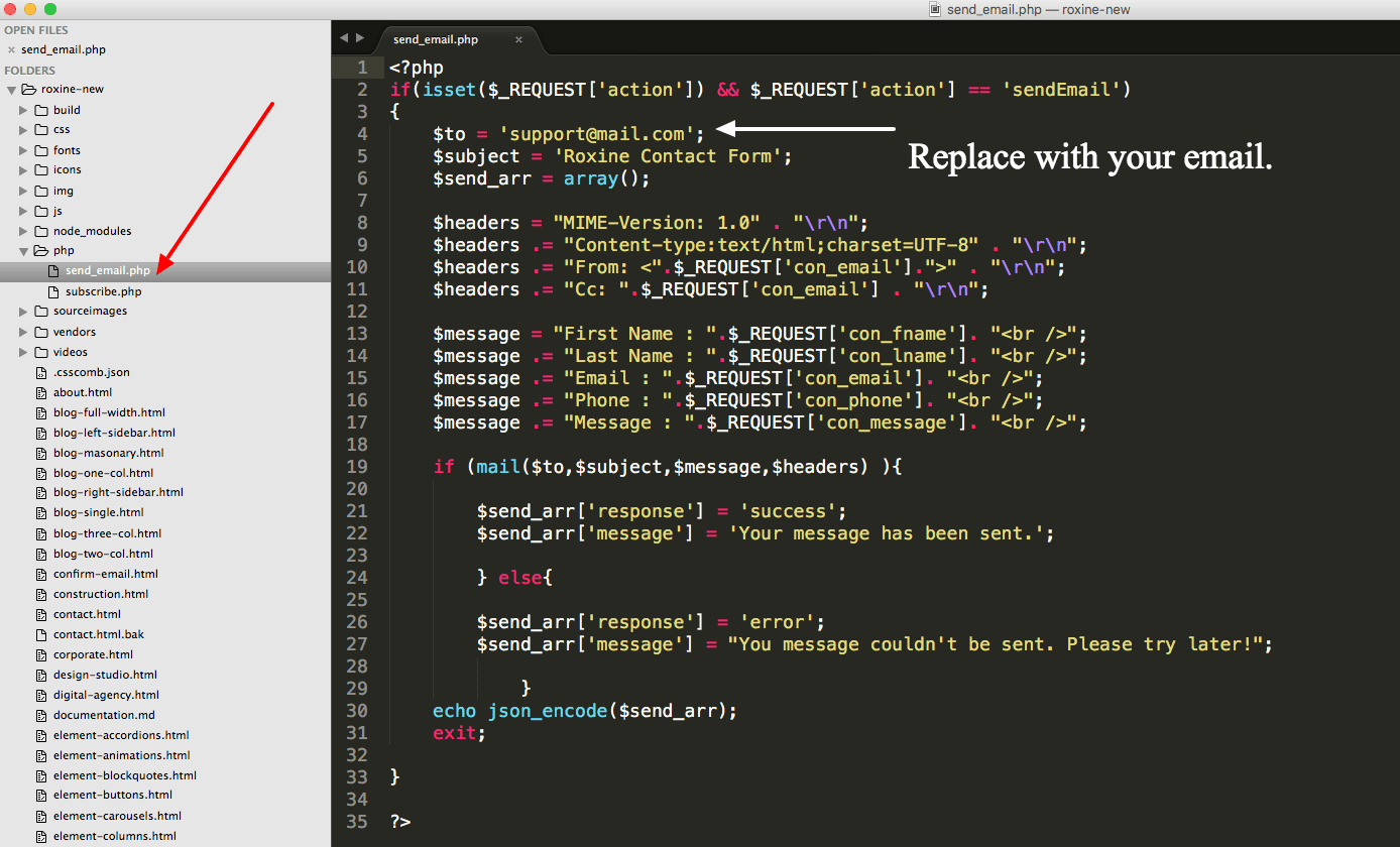
The template has a built in Ajax Contact Form and if you wish to use the “contact form”. The working example of this is provided in the contact.html page example. To set it to receive contact form messages in your own inbox, head over to php >> send_email.php and around line 4, replace
							$to = ‘support@mail.com';

							with

							$to = ‘your-own-email@your-own-domain.com’;
You can copy the contact form HTML form from contact.html to include in any other pages of your choice.
Elements / Components - #back to top
Inside build >> scss >> components folder, you will find multiple element block scss files which contain all the css rules for elements. We have used a class .demo-wrapper to contain elements in most cases as this is for demo purposes to show how this element can be integrated. So you can use .demo-wrapper class along with rest of html to place the code exactly as it is - or leave demo-wrapper class and style it with another class.

Revolution Slider Options - #back to top
We have included a premium revolution slider with our template. The revolution slider is one of the most popular jQuery slider plugins and you can find a lot of tutorials online for this plugin including videos. We have also included the documentation along with latest version of Revolution Slider which you will find in the main download folder.
Site Upload to Live Server - #back to top
After you have modified the template to suit your needs and you are ready to show your site to the world, you can just delete following folders/files and uplaod the rest to your server.
						Files and Folders to be Deleted before going live.
							-/build
							-/sourceimages
							grunt-settings.js
					        Gruntfile.js
					        package.json
					        csscomb.json
Helper Classes #back to top
| Class | Usage |
|---|---|
| .has-overlay | Adds color overlay of black with 80% opacity as default. |
| .bg-stretch | Stretches the background to 100% width |
| .lighten-overlay | Black overlay with 30% opacity. |
| .lighten-m-overlay | Black overlay with 60% opacity. |
| .black-overlay-1 to .black-overlay-9 | Black overlay with 10% to 90% opacity |
| .v-align-row | Vertical align center (to add this class on parent) |
| .bg-gray-light | Light gray background |
| .bg-white | White background | .bg-black | Black Background | .bordered | Default boreder style of 0.7143rem solid transparent; | .white-border | White border color for above border. | .bg-primary | Background color set to primary color. | .bg-secondary | Background color set to secondary color. | .bg-darker | Background color ser to dark grey. | .gray-transparent | Background color set to light grey. | .no-overlay | Has no color overlay. | .text-white | Text is set to pure white. | .text-black | Text is set to pure black. | .text-primary | Text color set to primary color. | .text-secondary | Text color becomes secondary color | .bottom-space | Adds bottom margin big. | .bottom-s-space | Adds small bottom margin. | .bottom-m-space | Adds medium bottom margin. | .top-xl-space | Adds extra large top margin. | .top-m1-space | Adds a medium-100 top margin. | .top-l-space | Add a large top margin. | .block-right | Sets left margin to auto. | .has-radius | Adds border radius of 1 rem. | .has-radius-huge | Adds border radius of 5.429rem; | .has-shadow | Add box shadow. Default 0 2px 1px 0 rgba($black, .3); | .transparent | Add full transparency - e.g. on transparent buttons. |
Support Desk #back to top
Please remember you have purchased a very affordable template and you have not paid for a full-time web design agency. Occasionally we will help with small tweaks, but these requests will be put on a lower priority due to their nature. Please be patient, polite and respectful and we will do our best to help you asap.
Please visit our profile page or ask question @waituk
Support for my items includes:- * Responding to questions or problems regarding the item and its features
- * Fixing bugs and reported issues
- * Providing updates to ensure compatibility with new software versions
- * Customization and installation services
- * Support for third party software and plug-ins
- * Make sure your question is a valid Template Issue and not a customization request.
- * Make sure you have read through the documentation and any related video guides before asking support on how to accomplish a task.
- * Make sure to double check the template comments section on items page.
- * If you have customized your template and now have an issue, back-track to make sure you didn't make a mistake. If you have made changes and can't find the issue, please provide us with your changelog.
- * Almost 80% of the time we find that the solution to people's issues can be solved with a simple "Google Search". You might want to try that before seeking support. You might be able to fix the issue yourself much quicker than we can respond to your request.
- * Make sure to state the name of the template you are having issues with when requesting support via ThemeForest.
Files & Sources #back to top
These are the primary CSS files used for general front-end styling. Use these to customize your theme even further. All included CSS codes under Roxine/css/
- 1. vendors/font-awesome/css/font-awesome.css - FontAwesome Font Icons stylesheet
- 2. css/fonts/icomoon/icomoon.css - Custom icomoon fonts
- 3. vendors/animate/animate.css - CSS3 animations css file
- 4. css/bootstrap.css - Bootstrap stylesheet
- 5. css/main.css - Main stylesheet
- 6. css/skins/color-1.css - The Color Variation
These are the various attribution inks to the Javascript files included or modified to work with in this theme. All included JavaScript codes under Roxine/js/
- 1. jQuery Library vendors/jquery/jquery-2.1.4.min.js">
- 2. Bootstrap JS vendors/bootstrap/javascripts/bootstrap.min.js">
- 3. Bootstrap Datepicker vendors/bootstrap-datetimepicker-master/dist/js/bootstrap-datepicker.js">
- 4. jQuery Mobile vendors/jquery-mobile/jquery.placeholder.min.js">
- 5. WOW Animation vendors/wow/wow.min.js">
- 6. Stellar Parallax vendors/stellar/jquery.stellar.min.js">
- 7. Validate JS vendors/validate/jquery.validate.js">
- 8. Waypoint vendors/waypoint/waypoints.min.js">
- 9. CounterUp vendors/counter-up/jquery.counterup.min.js">
- 10. Fancy Box vendors/fancybox/jquery.fancybox.js">
- 11. Owl Carousel vendors/owl-carousel/owl.carousel.min.js">
- 12. Revolution Slider js/revolution.js">
- 13. Mail Chimp js/mailchimp.js">
- 14. Template JS js/jquery.main.js">
Credits #back to top
All Images used in the theme demo are from either Dollar Photo Club, Unsplash or Pixabay. Unsplash and Pixabay Images used in this theme are in Public Domain which you can view at the link provided, and available for commercial use. However, Dollar Photo Club images must be purchased. The links are provided for all images.
- https://www.shutterstock.com
- http://www.videvo.net/video/flying-between-the-clouds/2161
Note: Icons used in the template are from the noun project, and fontastic. You can legally use any of the icon included with the theme and add your own icons from noun project for free (attribution required in some cases).
- Font Awesome: http://fortawesome.github.io/Font-Awesome/
- Ion Icons: http://ionicons.com
- The Noun Project: https://thenounproject.com/
- Octicons: https://github.com/primer/octicons
- Mini Icons: http://www.webalys.com/minicons/icons-free-pack.php
- Foundation Icons: http://zurb.com/playground/foundation-icon-fonts-3
- Entypo Icons: http://www.entypo.com
- Subtle Patterns: http://subtlepatterns.com/
Version History (Changelog) #back to top
Once again, thank you so much for purchasing this template. As I said at the beginning, I'd be glad to help you if you have any questions relating to this template. No guarantees, but I'll do my best to assist. If you have a more general question relating to the templates on ThemeForest, you might consider visiting the forums and asking your question in the "Item Discussion" section.
If you like this template, please do not forget to rate it
Changelog
						-----------------------------------------------------------------------------------------
						Version 1.0.0 - July 2017
						-----------------------------------------------------------------------------------------

						- Initial Release